
We are excited to announce updates to the Applicant Tracking System (ATS) Admin Workspace. We have modernized the ATS Admin Workspace to an enhanced design system so district administrators get a cleaner, more intuitive, and more consistent experience when managing hiring.
Key Changes
-
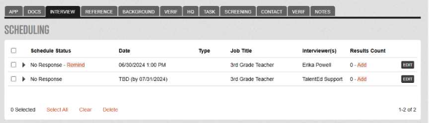
Blue Folder Tabs (References, background, Screening, Begin Hire, etc) have been modernized so recruiters can reliably move candidates through every step.
-
Primary actions have been standardized across the product, with a consistent top‑right placement, while outdated “Exit” buttons have been removed.
-
Success messages and dialogs have been improved for clarity and consistency.
All Customers (Current User Experience)
-
Key workflows are not changing.
-
You may notice minor user interface changes this Fall.
-
There is no action required on your end for these changes
-
Updates will be made available as part of the 26.7.0 release
-
Summary of changes with 26.7.0:
|
Before August 2026 |
After August 2026 |
|---|---|
|
Previously, date pickers opened on a separate page. 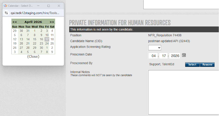
|
Date pickers now display inline on the current page instead of navigating to a new page. 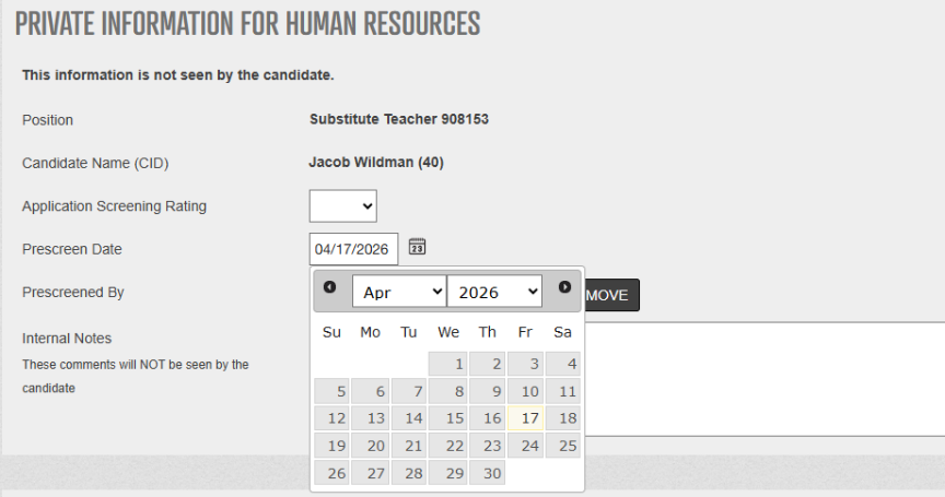
|
|
Previously, headers and footers were displayed, and only pagination was hidden. 
|
Now, a clearer UI, headers, footers, and pagination are hidden, displaying only an empty state message. 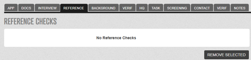
|
|
Previously, pagination controls, Jump to page, and Results were outside the table. 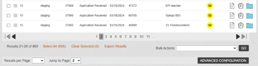
|
Now, pagination controls, Jump to page input, and Results display within the table for better usability. 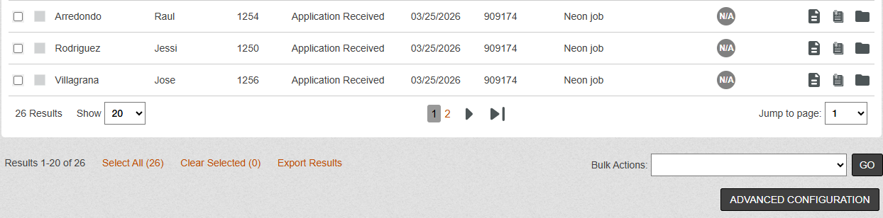
|
|
The columns did not use the full available width.
|
Pages now expand to use available screen width, optimizing display for modern monitors. 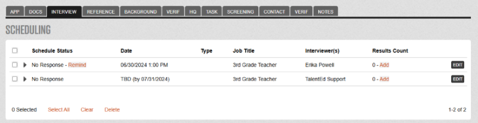
|
|
Button styling, spacing, and sizing were inconsistent. 
|
All buttons have been updated with consistent styling, spacing, and sizing throughout the UI for improved visual coherence. 
|
|
Previously, the primary action buttons were at the bottom of the page. 
|
Primary action buttons have been moved to the top of pages for easier access. 
|
|
Legacy search boxes were not consistent across the application. 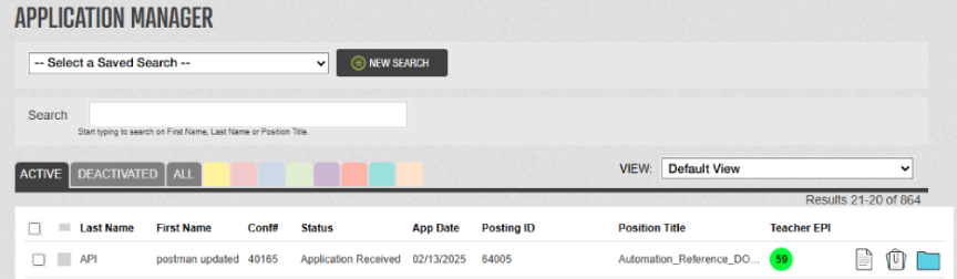
|
Search boxes include a magnifying glass icon, a helpful search tip, and are consistent across the application. 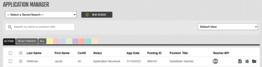
|
|
Confusing Exit buttons that navigated to inconsistent locations have been removed.
|
Use standard browser navigation or the left-navigation menu for clearer, more predictable navigation. |
|
UI elements do not fully meet accessibility standards for font sizes, color contrast, spacing, alignment, and labels |
UI elements with improved font sizes, color contrast, spacing, alignment, and labels now meet the accessibility standards. |